
Sometimes branding yourself is too difficult to do by yourself.
I get it. It took me just about 6 years and many many MANY versions to land on the logo I use today. It is really difficult to understand yourself, much less come up with a logo that encapsulates your branding identity.
Sydney, a lovely graphic designer and photographer in her own right, approached me for help with that exact issue. She had a few logo concepts in her mind, but she was unsure how to create a polished look from her ideas, or a business card design to match her vision.
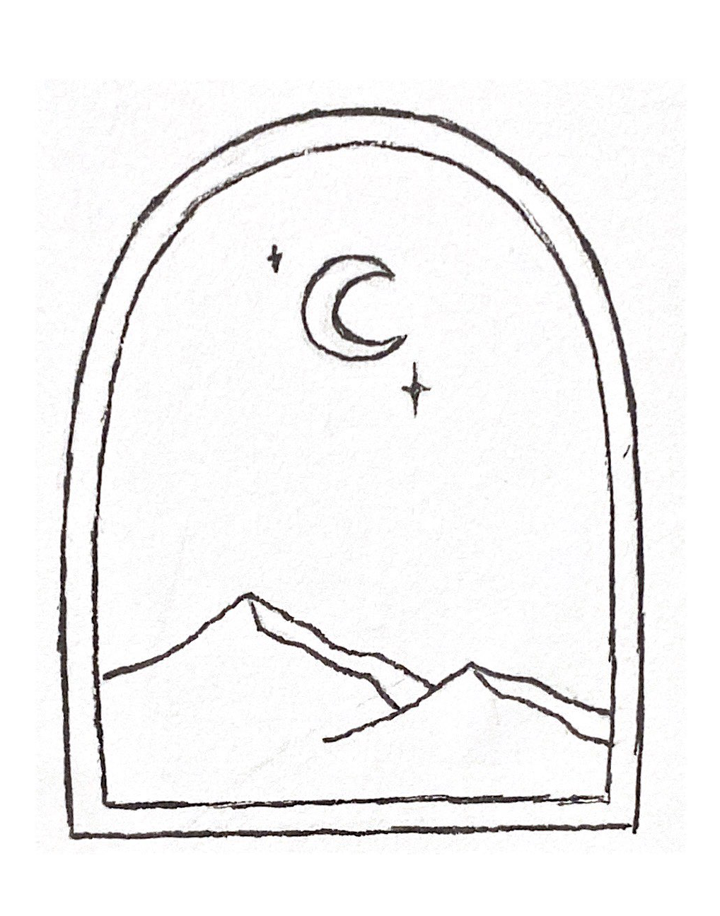
It started with a sketch.
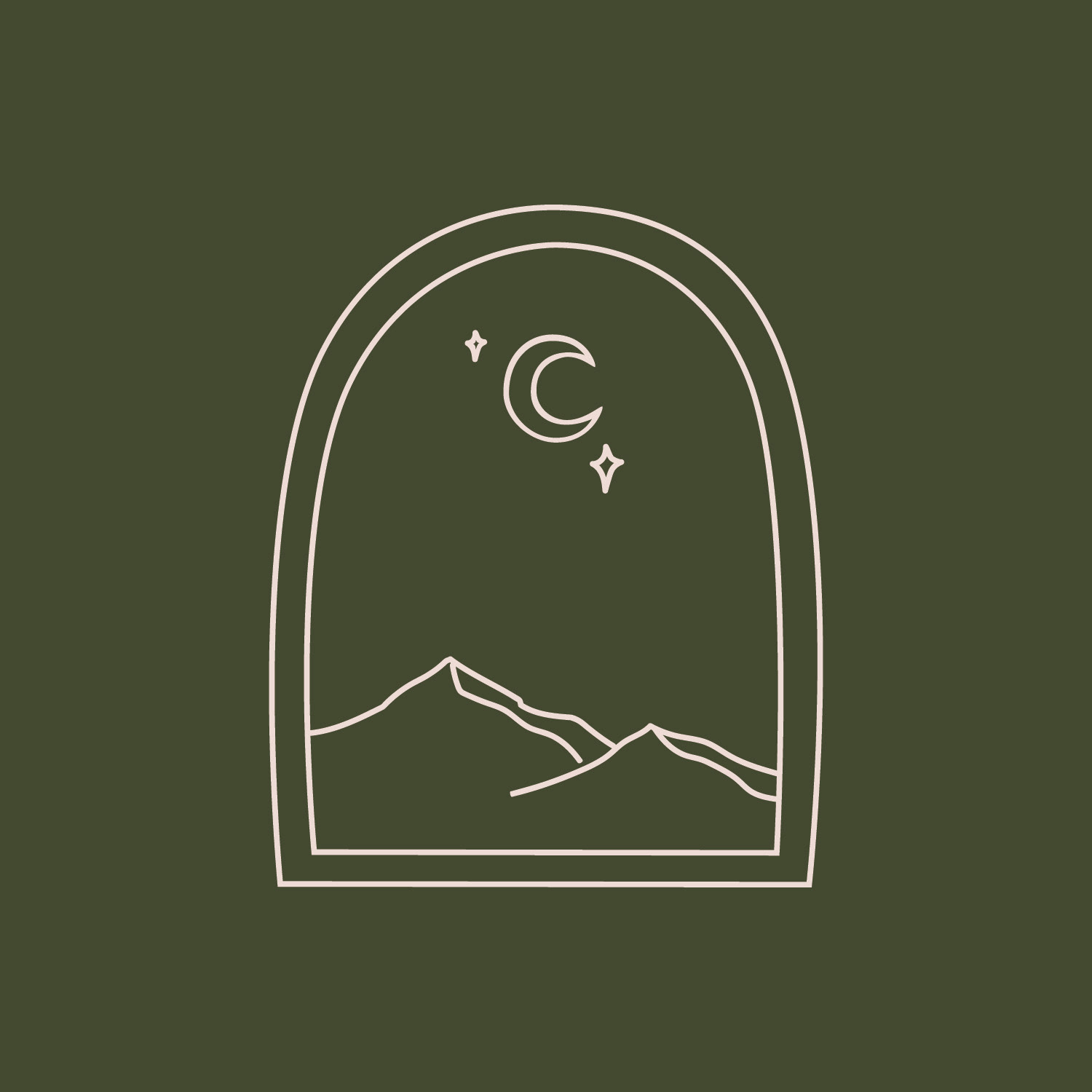
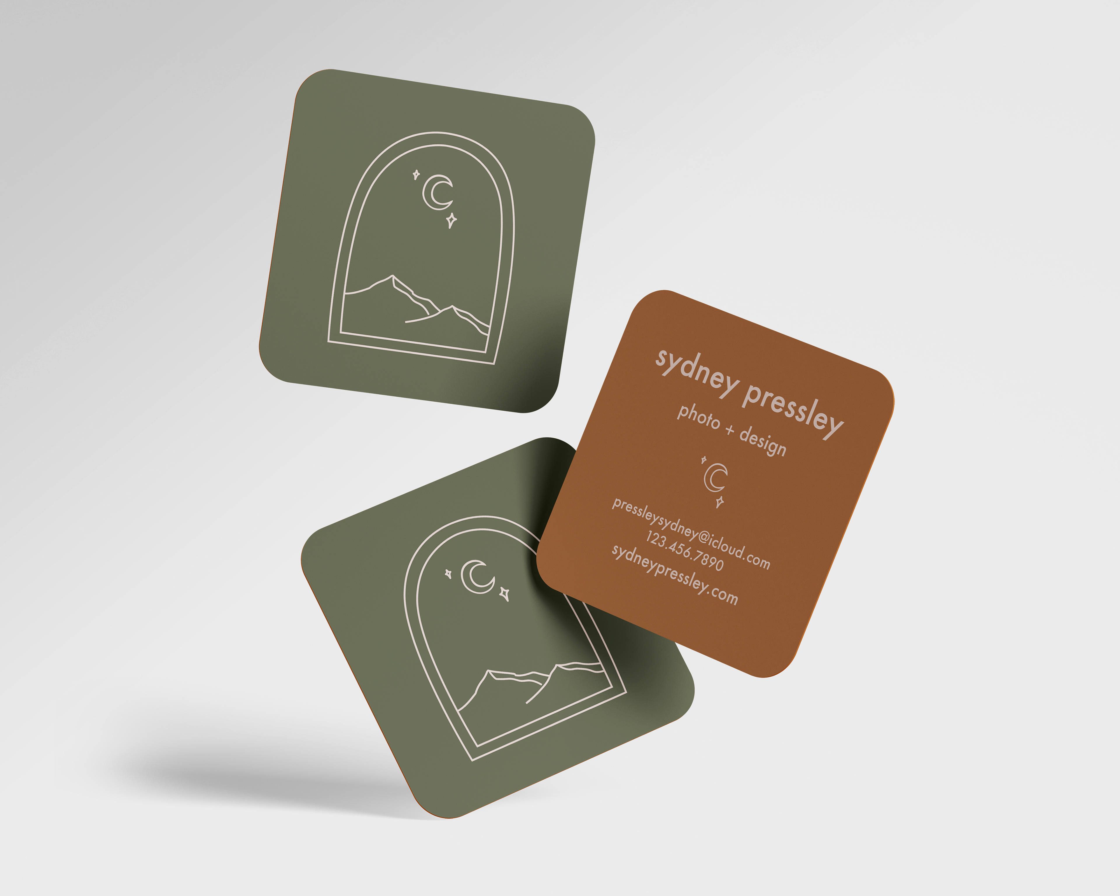
Sydney sent the above sketch for me to translate in Illustrator into a polished look. Using the pen tool, I started to trace the angles around each shape. While still preserving the hand drawn imperfections, I adjusted the angles to bring a professional look to Sydney's draft. The resulting logo popped off the screen.
Above is a video of my logo vectorization process using Adobe Illustrator, mostly through the pen and direct selection tools at 5000% speed. I wish it happened that fast in real life!
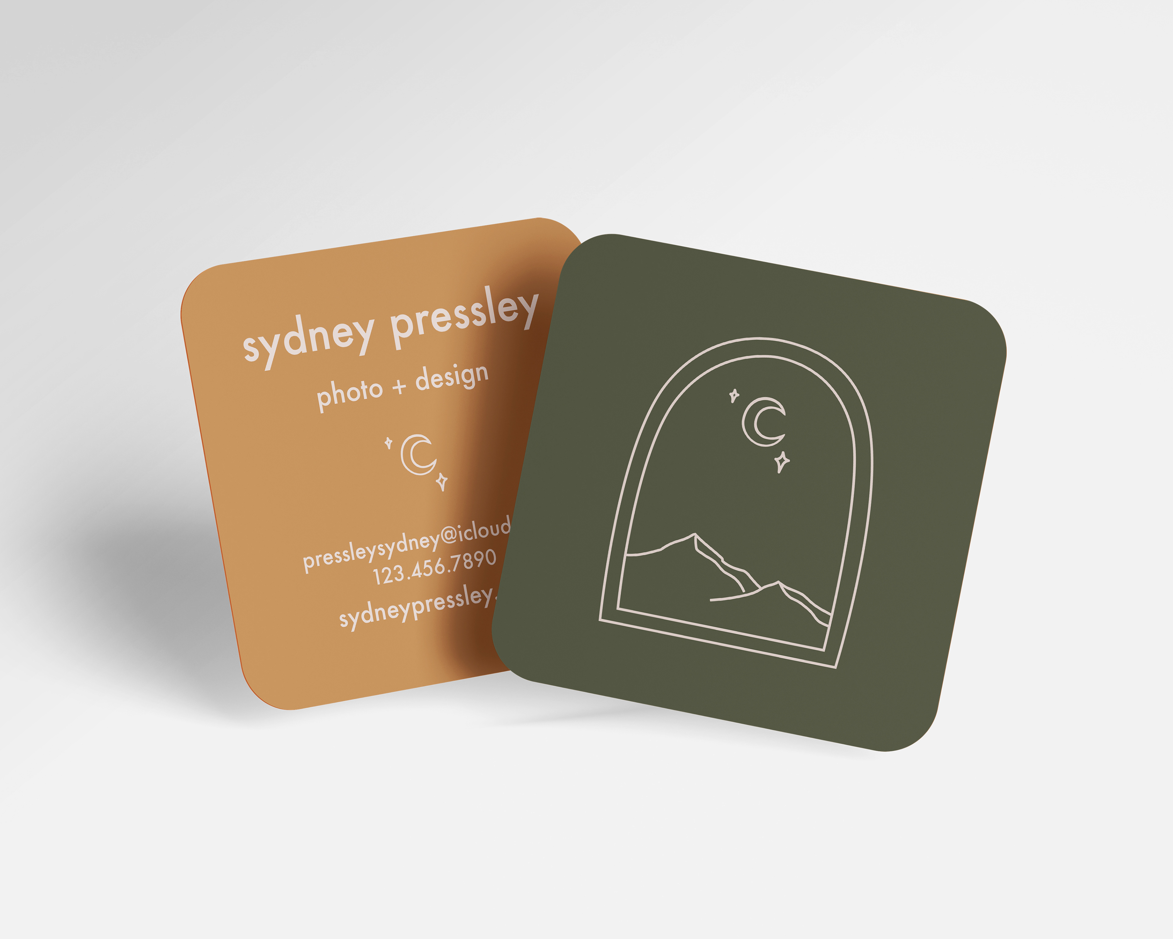
For the business cards themselves, I recommended to Sydney that a square shape would highlight her logo shape as well as set apart her business card as something unique. After a few versions, she ended up asking specifically for Futura Medium as the typeface for the back. With a more casual look for the font, I decided to change her title from "photography & design" to "photo + design" to soften the wording and fit the style direction we went in.

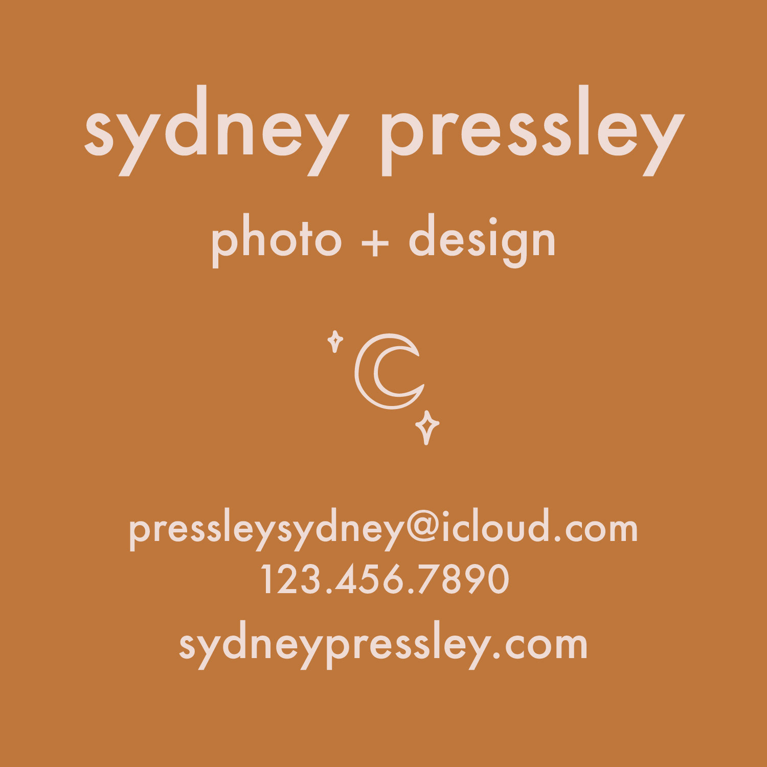
The soft green, earthy orange, and light creamy pink were a few colors from lovely color choices sent over by Sydney that matched with her existing color palette for her photography Instagram. I loved these warm neutral choices paired with the whimsical design, they just fit so naturally. I carried over the moon and stars from the logo to the back as a separator to bring the front and back of the card together as one cohesive element.
Sydney! Give yourself a high five! You have a brand now!
We conquered a tough task together, and I just love what we were able to create together.