Integrating playful data visualization into narrative tools used to enable sales and drive brand interest
My Role: Art Direction, Asset Creation (Ad Collateral, Web Design)
Team: Partnering with Marketing & ABM teams
Tools Used: Adobe InDesign, Illustrator & Photoshop; Hubspot
Goal: Generate 10+ qualified sales leads
Project Brief
Optoro was launching a new version of their returns portal with an in-house tech stack (previously used a vendor partner) so marketing and design were tasked with “reintroducing” the product while reflecting the progress made.
Problem: How do we express the new platform without spooking our current clients who used the old product?
Solution: Focus on the full-platform solution of Optoro’s tools, show off the new platform’s look, and try out an updated quippy brand voice.
Key Message: Bad returns experiences at any stage could mean one less customer, so invest in returns tech now.
Background & Research
Some common themes from user research my team and I had conducted were that our past/ current product explanations were convoluted, so we wanted to tackle this campaign with a more down-to- earth visual and narrative approach.
Focus: “This campaign hits on inconveniences that customers experience throughout all stages of the returns process, while showcasing why Optoro’s returns solutions are the better way to approach returns.”
Tone: Clever/Tongue & Cheek, Relatable, Bold/Impactful Colors & Type
Project Deliverables
Website
- Hubspot Landing Page
ABM/Events
- Event Booth Design
- One Pagers
- Gift Activation
- One Pagers
- Gift Activation
Digital
- Social Collateral
- LinkedIn & Twitter Ads
- Emails (Corp, Sales, ABM, BDRs)
- Employee Signature Banner + Social
- Emails (Corp, Sales, ABM, BDRs)
- Employee Signature Banner + Social
Mid-Campaign Pivot to Phased Approach
As my team and I were working on the planning and execution of this campaign, our timeline was drastically moved up. Originally we planned to launch the new product campaign after a large Event, but we were told that leadership wanted the new campaign to be launched leading up to the Event.
Thus, with quick thinking, we decided to take on the campaign as a phased approach: executing the ad and email collateral first, and then focusing on client case studies and ABM later on by creating more content, but also refreshing the original ad collateral with updated CTAs for evergreen content.
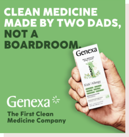
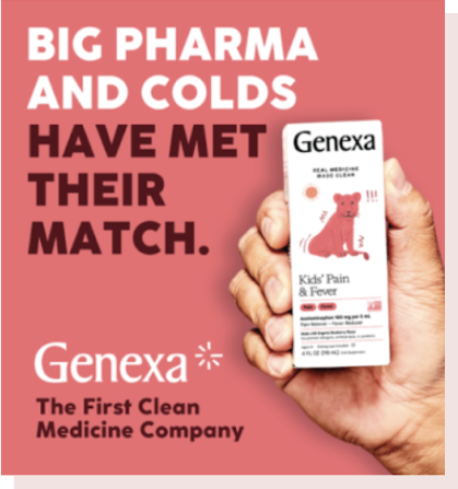
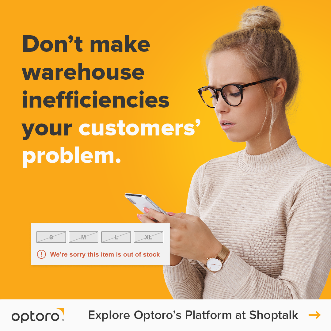
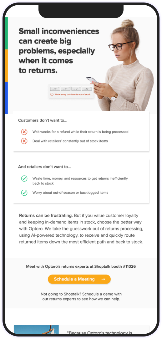
Bold & Down-To-Earth
Use of bold typography and fully saturated backgrounds brings not only visual interest to these ads, but is a step away from our normal clean and minimal visual approach.
I also wanted to show the consumer actually using the product, complete with fabricated UI to instantly connect with consumers and retailers.

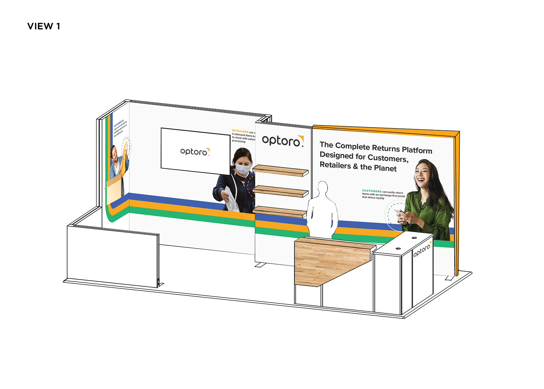
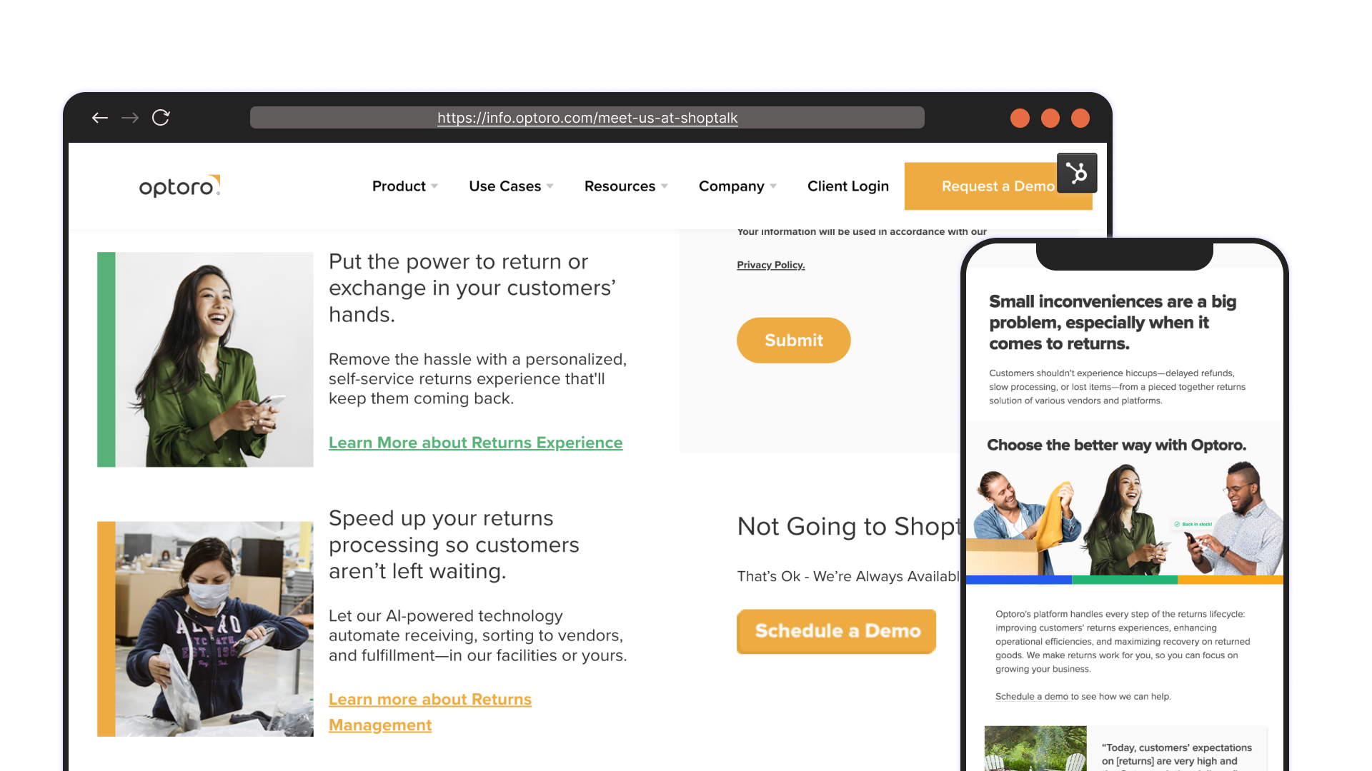
Shoptalk Booth Mockup
Fully Designed Email Slices
Due to the size of our team and not having as much focus on brand emails, we usually opt for general email headers rather than fully designed email slices.
However, with the gravity and visibility of this campaign, my team and I decided to design full emails: one highlighting each of our 3 products and one full platform email, resulting in much higher engagement, open rates and click-through.
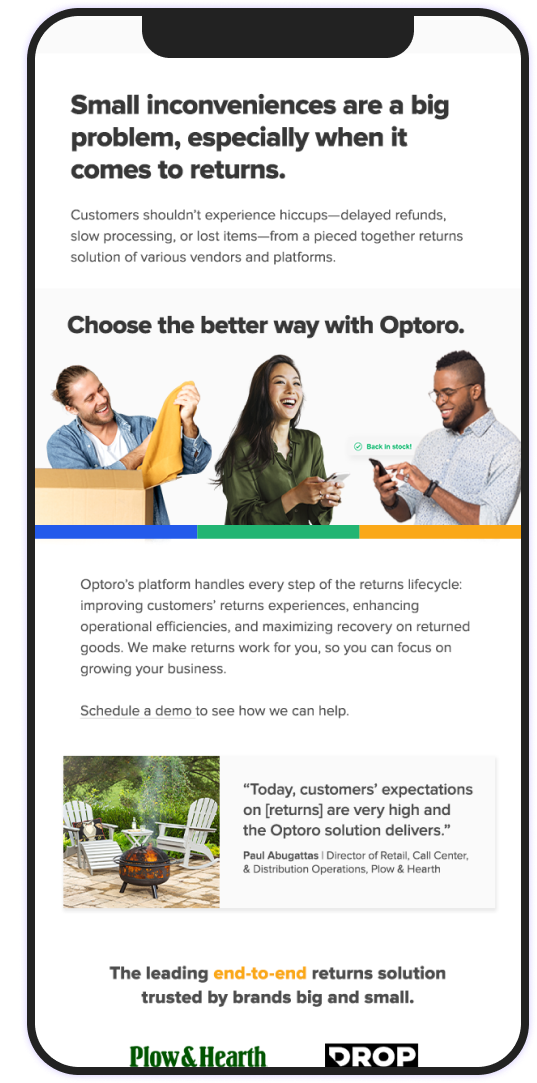
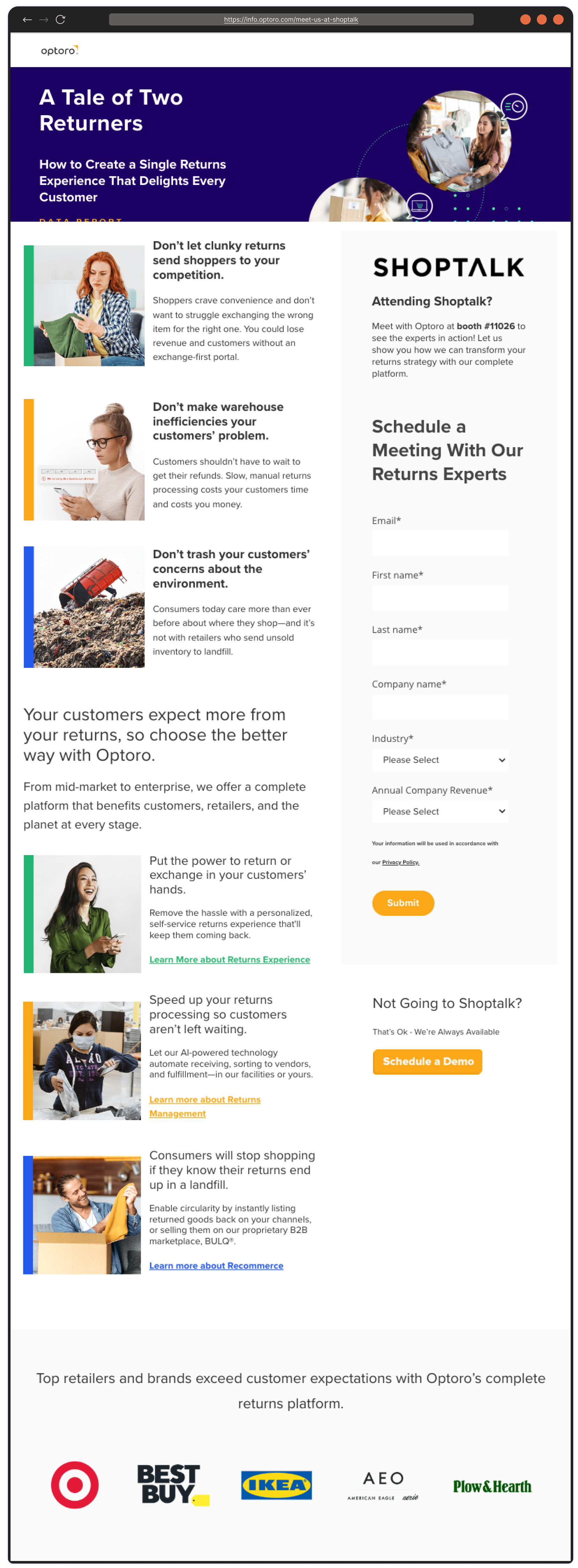
Shoptalk Landing Page
Results: Full Platform Campaign
The performance of this campaign far surpassed that of past campaigns and our normal CTR and conversions.
- 3x email open rate vs normal open rate
- 2x+ social engagement vs normal engagement
- 54 MQLs and 7 ISMs (goal: 10 MQLs)
- 2x+ social engagement vs normal engagement
- 54 MQLs and 7 ISMs (goal: 10 MQLs)
Reflections & Learnings: Collaboration from the start
I really enjoyed working on this project. I felt like I had more creative control from the beginning of the project. Having the opportunity to not just partner with marketing, but really collaborate from the very start of the ideation stage made for a powerful and effective campaign.
Our gut instinct to focus on consumer imagery really connected with retailers. Retailers are, after all, consumers themselves, so humanizing their frustrations with returns struck a nerve that converted into MQLs and contacts.
As a result, we were left with very strong evergreen content for the new product and full platform.