Finally! A project to my mediocre watercolor skills to the test!
Okay, but seriously, I'm terrible at watercolor. It's a super difficult medium to work with and it has always perplexed me. But here's the real problem: digital watercolor brushes have never looked right to me. They are usually based off a set pattern, so they start to look repetitive in short order.
When Emily approached me wanting to incorporate watercolor into her wedding invitations, I remembered a technique I used a couple of years ago when I used real watercolors and then scanned the painting into Illustrator and Photoshop. That's exactly what I was going to do this time around.
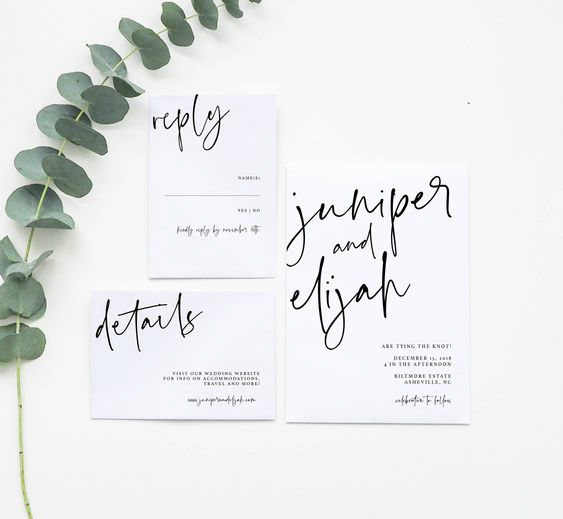
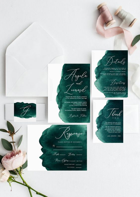
Inspiration

Watercolor Background
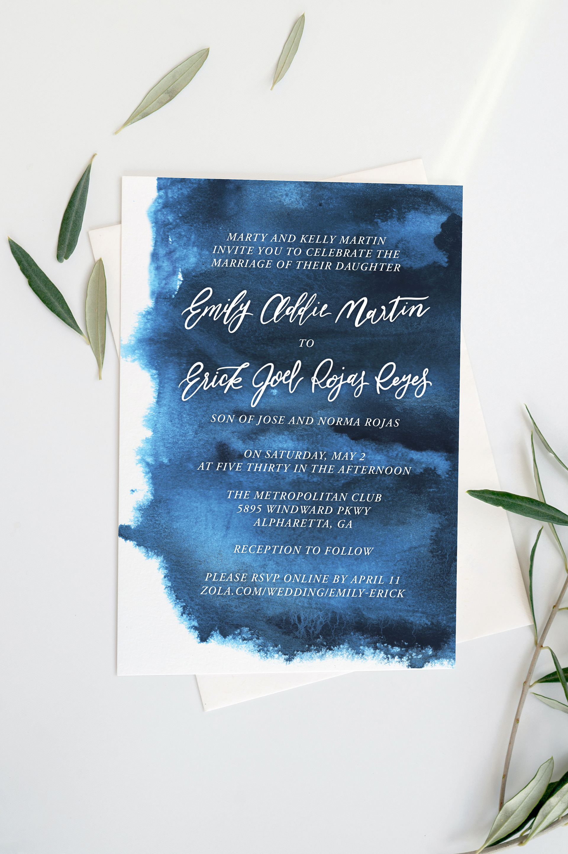
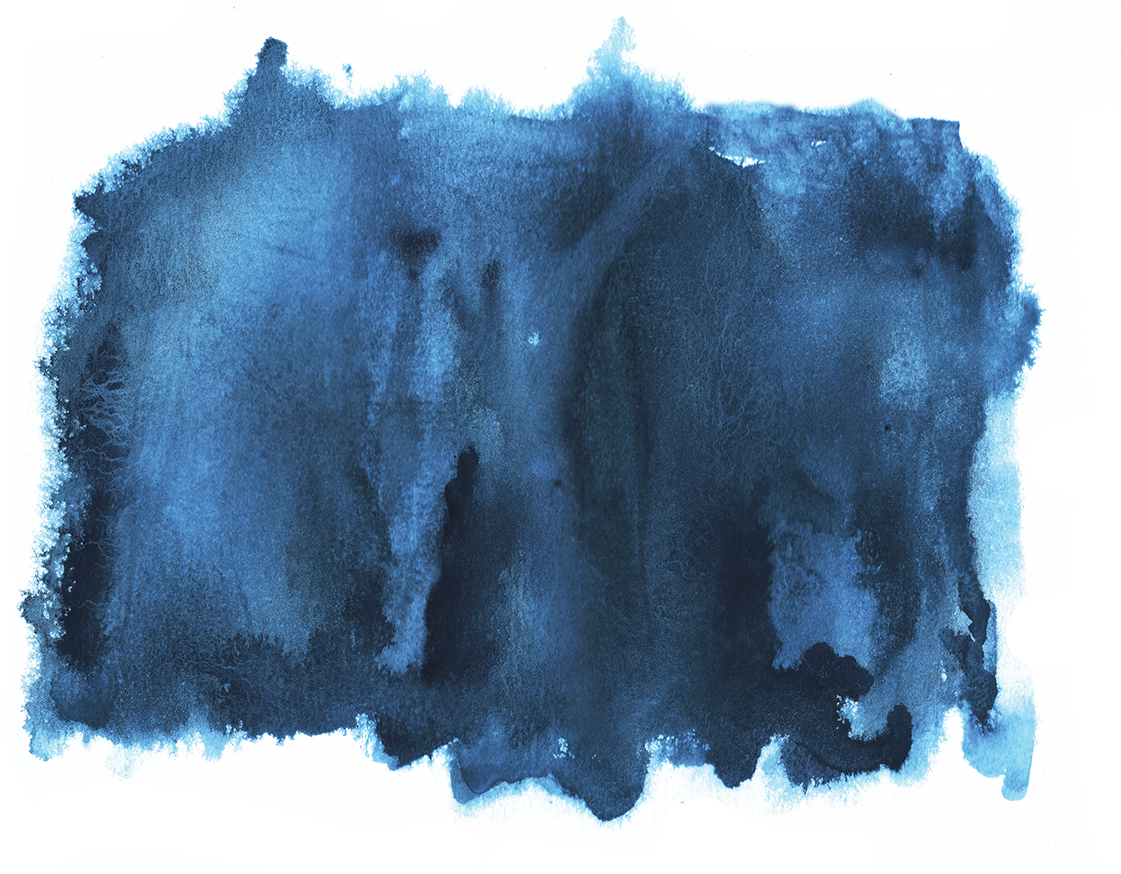
I mixed a good bit of cerulean blue when I was making Emily's watercolor background. I wanted there to be those jagged edges and water spots to give the appearance of texture. After scanning the pattern in, I used some adjustment layers in photoshop to create more contrast and saturation, bringing life back to the background. The color I mixed in real life was not really translating digitally, so I ended up using a clipping mask on multiply to recolor the piece to the original color Emily wanted.
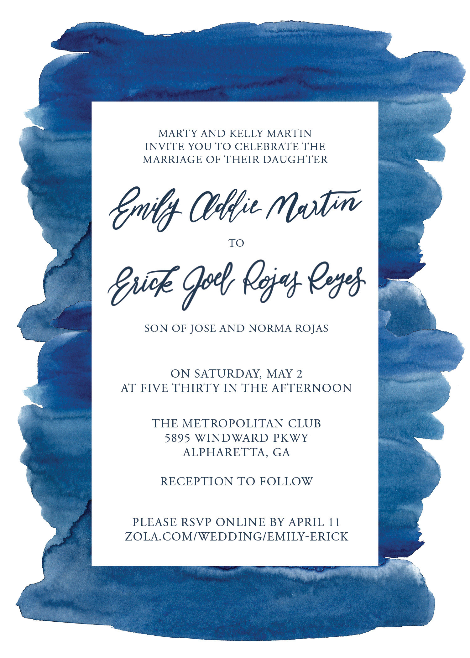
I played around with having a white box on top of the watercolor background, but ultimately Emily chose to have white text over top of the dark blue texture.
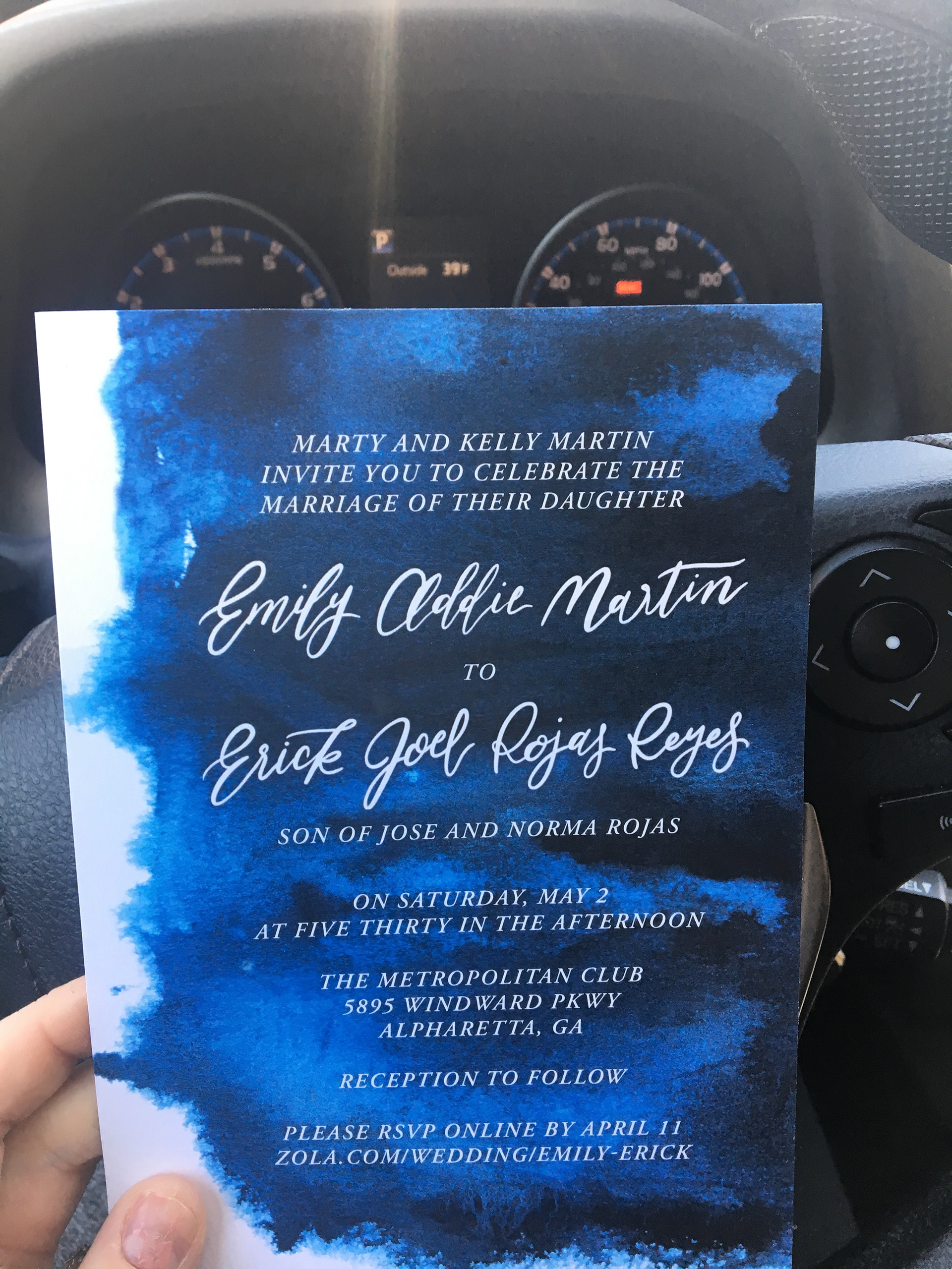
Emily texted me this photo of her invitations in real life after they had been printed. I'm super pleased with the contrast I was able to achieve with the dark blue background and white text. Congrats Emily and Erick!