
Another amazing client! Her new fun and quirky cards are just as personable as she is.
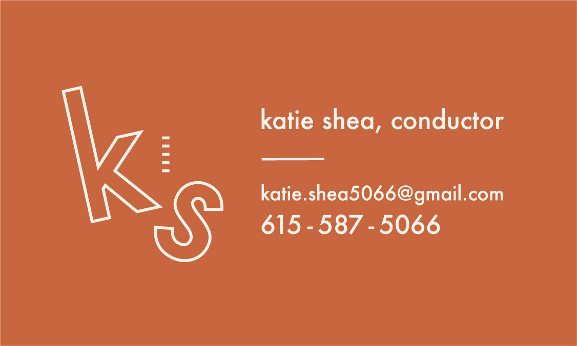
Katie is a musical conductor, so the logo on her cards shows movement and in a subtle way references the 5-line musical staff. She wanted cards that are memorable, eye-catching, yet professional at the same time. Subtle earth tones are approachable and warm, just like Katie!
Katie is a musical conductor, so the logo on her cards shows movement and in a subtle way references the 5-line musical staff. She wanted cards that are memorable, eye-catching, yet professional at the same time. Subtle earth tones are approachable and warm, just like Katie!