Lorne + Anna: Wedding
Invitations and a New Plan
When my sweet friends Lorne & Anna announced their engagement, I seriously begged them to let me design their invitations. They graciously agreed. At first when we discussed what style they were looking for, they told me they were going for a more modern look with some calligraphy and some natural elements incorporated. I started with some concepts for that, but none of the designs sat well with me. They felt really generic and templated, so I decided to experiment with a different style altogether.
I really love the arts and crafts movement. It was one of my favorite periods of art history in college. I love the "extra-ness" of the entire movement. It is so antithetical to our modern obsession with white space and breathing room. Arts and Crafts doesn't care about your aesthetic, it just wants to fill the room. This maximalist style of filling every little space just seemed to fit this project. I don't know, call it a gut feeling. I have learned through the years that following my gut is the truest form of bravery in creativity...and often times, it's just the right decision.
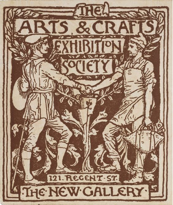
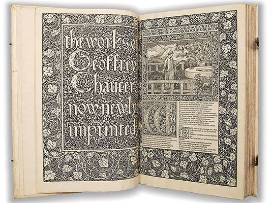
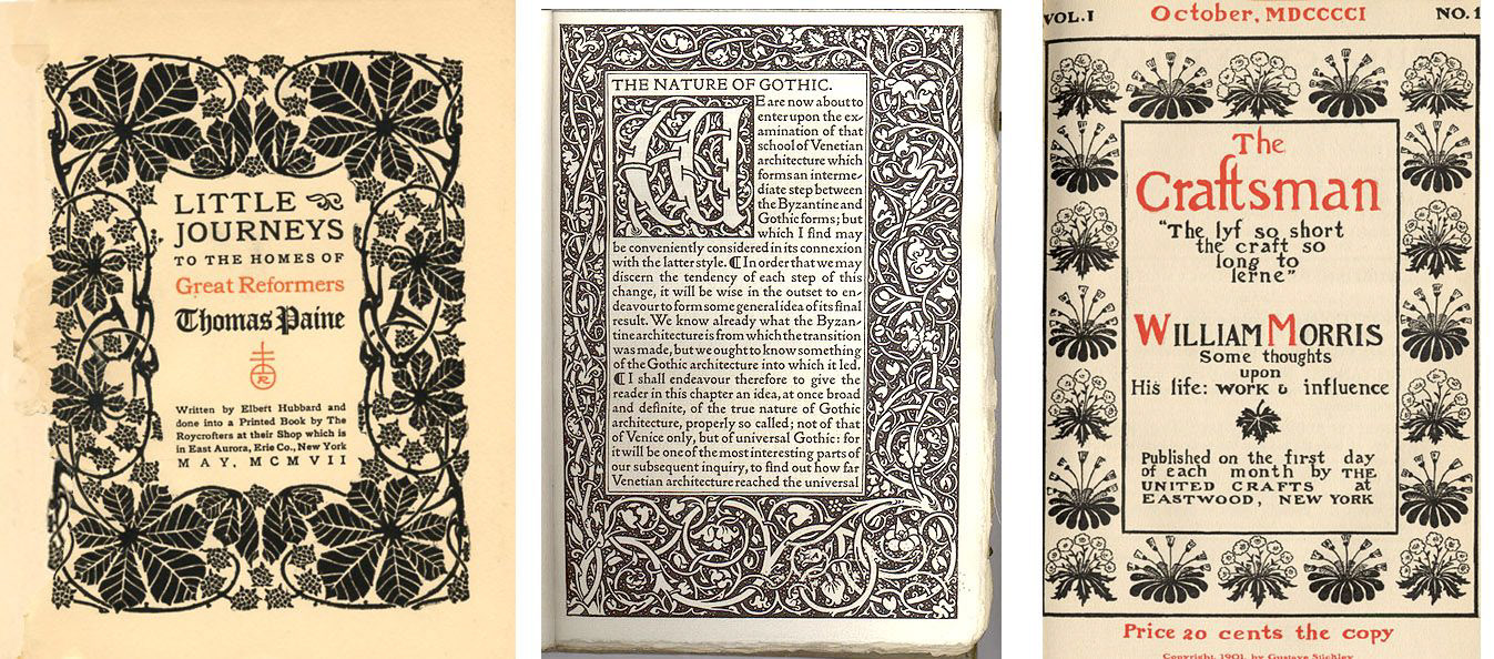
Inspiration from the Arts and Crafts Movement which flourished between 1880 - 1920
The Final Look
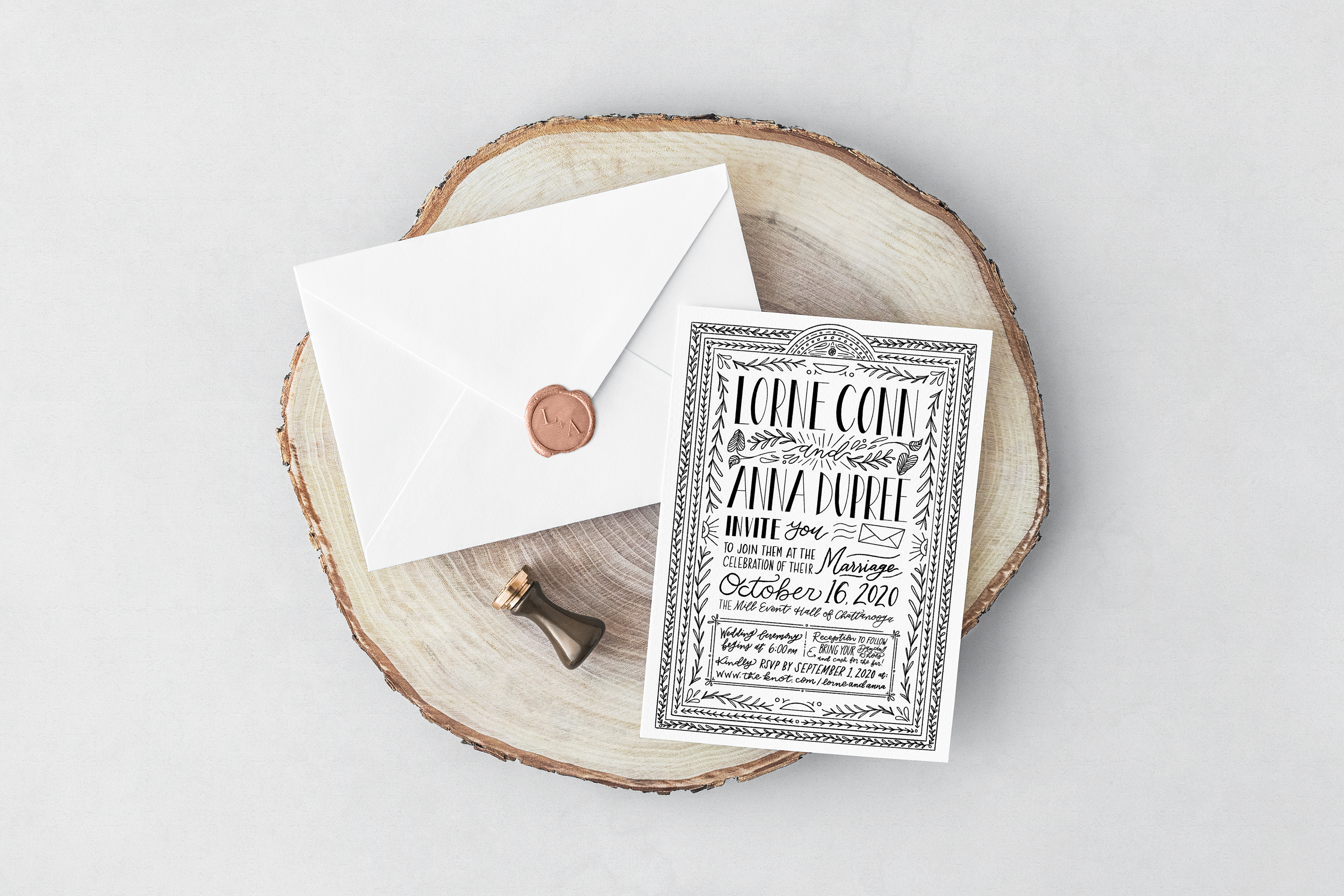
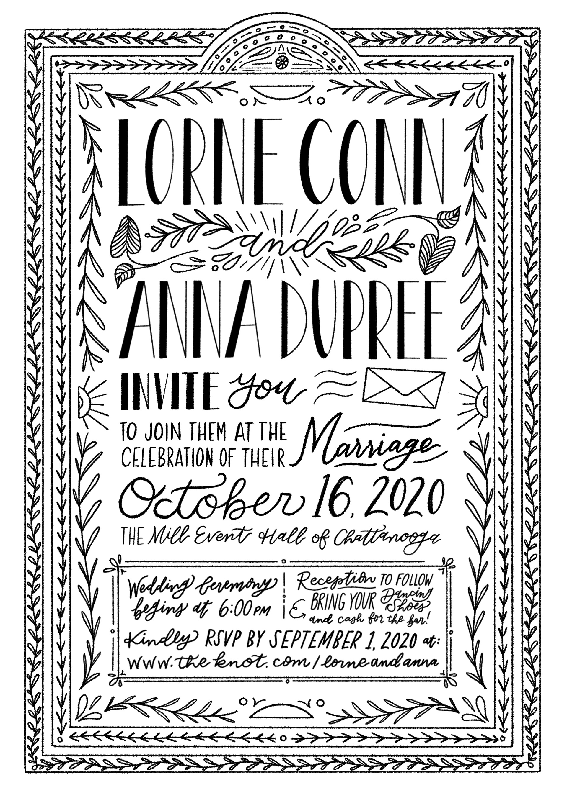
After deciding on the new direction, I started by sketching a frame for the invitation. I was really going for that classic story book look you see over and over in Arts and Crafts. There really isn't any negative white space when it comes to the Arts and Crafts movement, so I followed suit by filling in as much space as possible. In our initial consultation, they told me they wanted to incorporate some natural plants and foliage, which was the perfect medium to fill space.
While the classic look usually included color, I chose to stick to black and white to increase contrast and readability, as well as helped with Lorne and Anna's budget by giving them the opportunity to print in black and white to save money. Personally, I love the black and white look.
Process Video
A New Plan
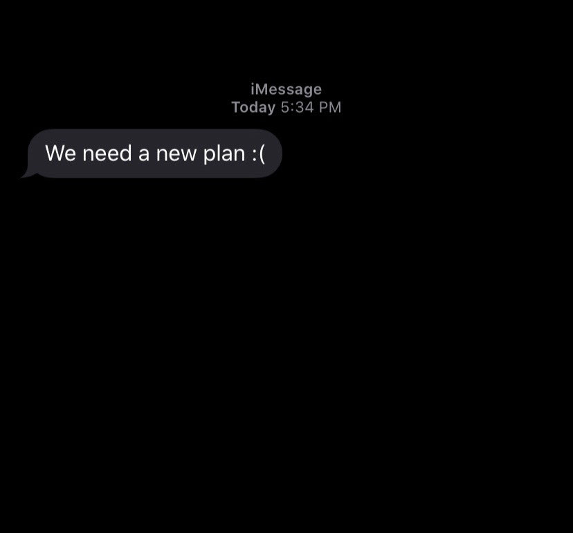
A couple weeks after the initial invitations were fresh off the printer, I got a heartbreaking text from Lorne letting me know that they were going to have to cancel their initial wedding plans for a more stripped down and safe wedding.
While I was so sad with them that they needed to restructure the wedding, I am incredibly proud of their decision in the face of COVID-19 to keep their family and friends safe. I was happy to help them with designing a letter that would be sent instead of the original invite. I decided that with their timeline and budget for the second design to reuse the intricate borders from the first round invite and then adding in their letter with type instead of hand drawing it. That way I could ensure it would resemble the first invite, yet would be readable and ready to go ASAP.
I made the initial header and footer, giving myself enough room to fill with the copy I was given and started with three font options for them to choose from.
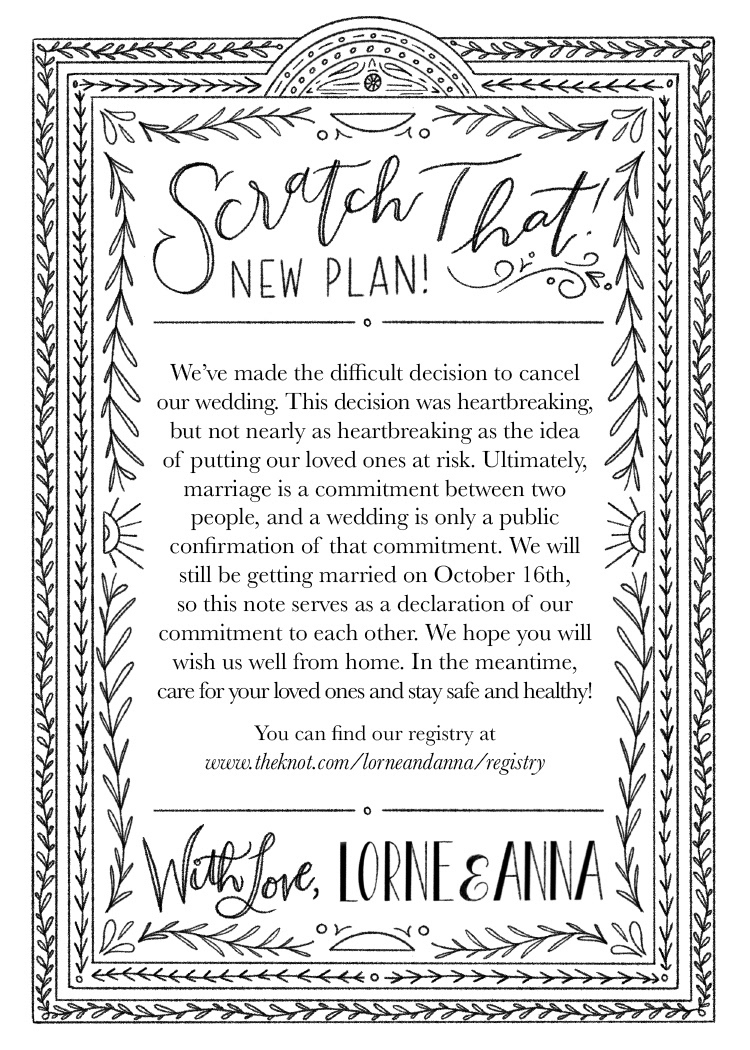
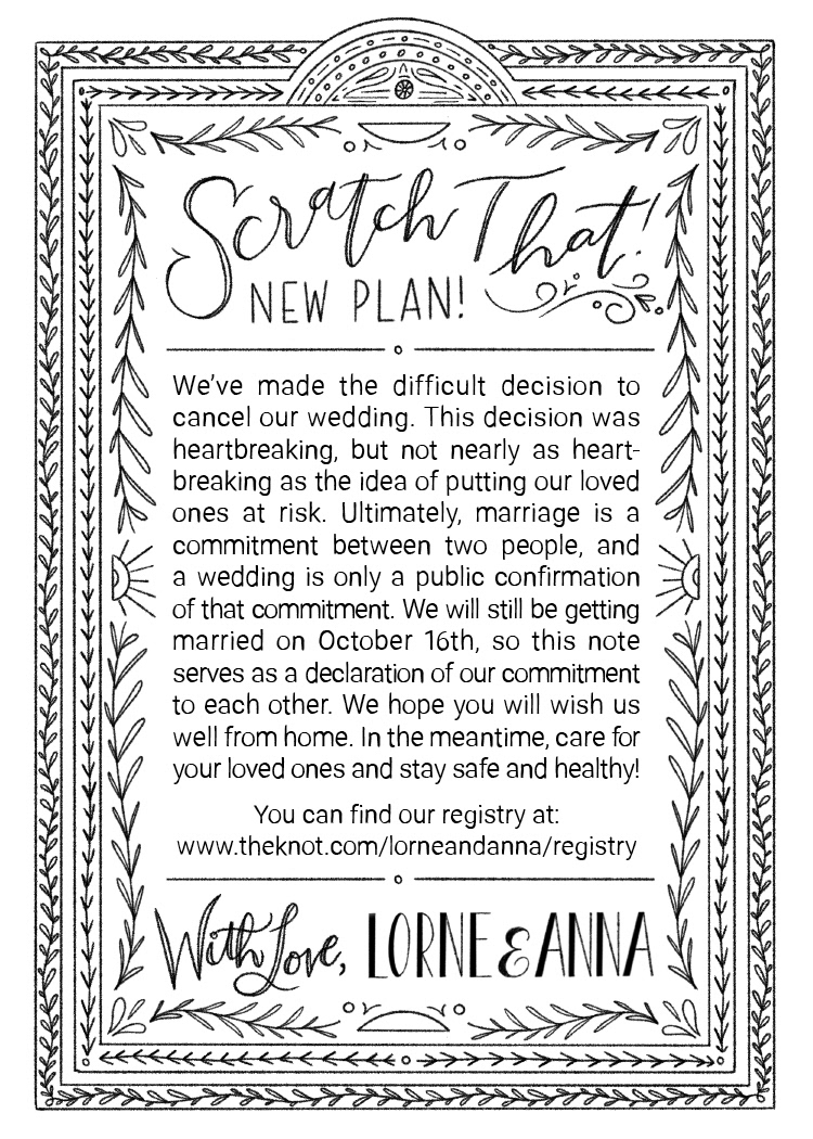
After some discussion, Lorne and Anna chose font #1 which was Baskerville, although they liked the justified text of the other two styles, so I ended up combining them for the final design.
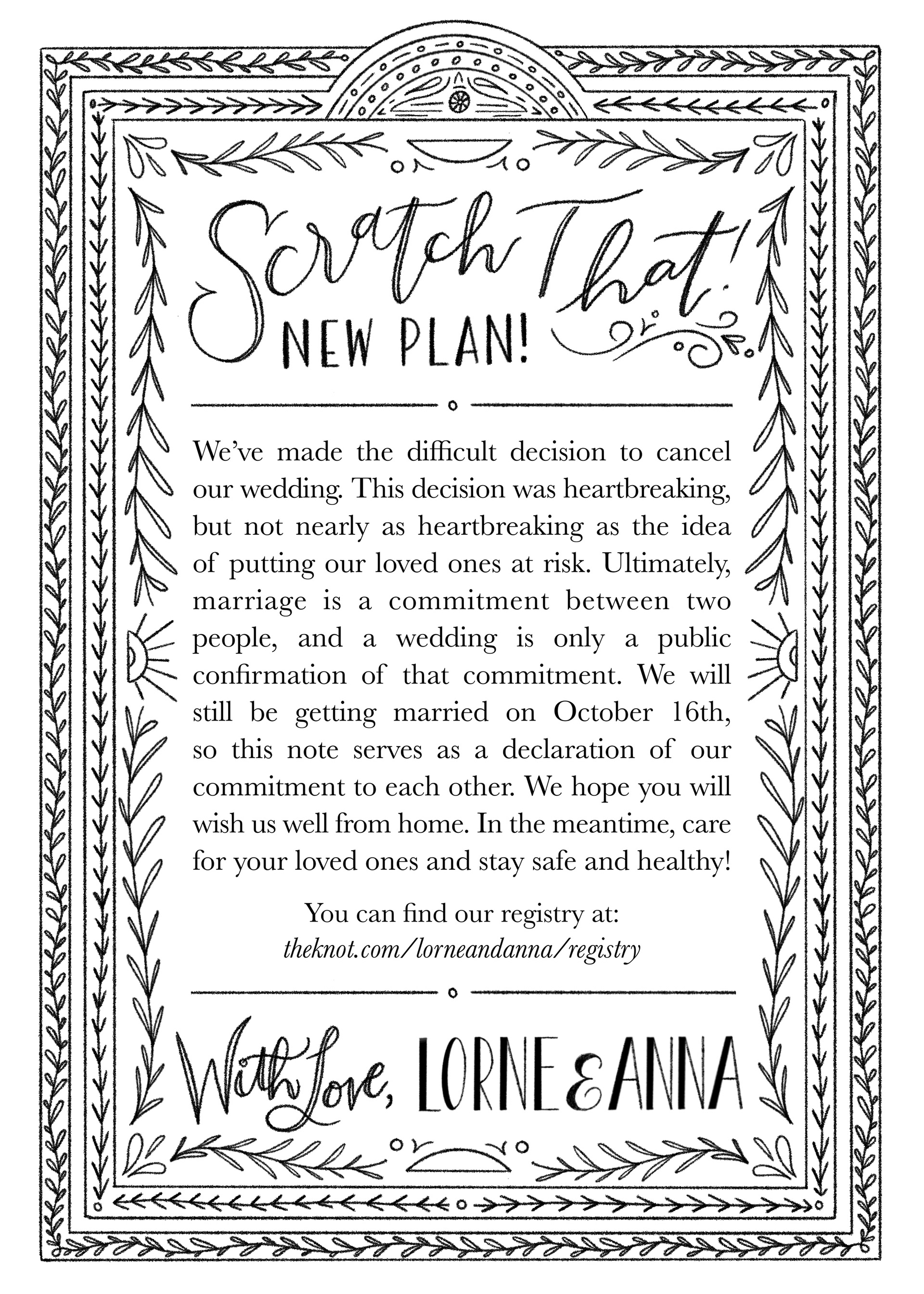
Sometimes, you need a new plan. I'm here to help!
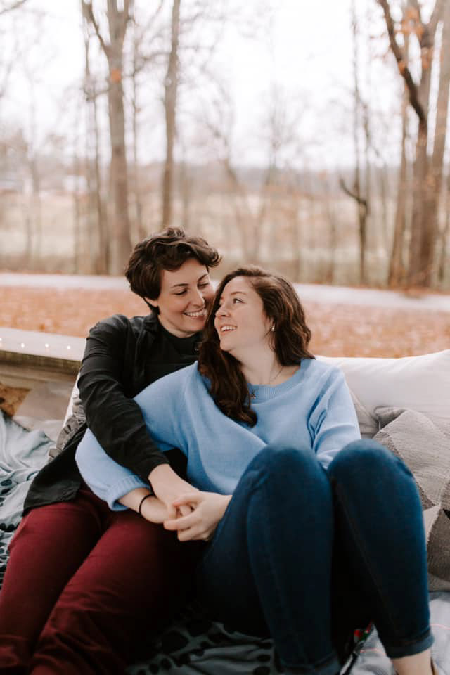
Engagement Photos by Hannah Morgan
(RUN not walk to her website!)
(RUN not walk to her website!)
Special thanks to Lorne and Anna for trusting me with their wedding invitations, my crazy ideas, and subsequent changes and updates to the plan. I love you guys, and I'm so excited for you both to get married this October. Congrats!