Integrating playful data visualization into narrative tools used to enable sales and drive brand interest
My Role: Art Direction, Asset Creation (Layout & Web Design)
Team: Partnering with Marketing
Tools Used: Adobe InDesign, Illustrator & Photoshop; Hubspot
Goal: Generate qualified sales leads through engaging thought leadership content
Project Brief
Optoro creates thought leadership content at least every quarter to promote their reverse logistics solutions
Problem: Optoro’s past data reports are often dry and fewer than engaging with fewer conversions to MQLs than wanted.
Solution: Experiment with a new narrative voice in the writing and presenting of data, test out a new approach to the landing page, and ultimately liven up the content so it was more digestible and convertible to qualified sales leads.
Project Assets: (4x times a year)
Layout
- 10-16 page PDF layout document
- Custom Data Visualization Illustrations
- Custom Data Visualization Illustrations
Website
- Hubspot Landing Page
- Hubspot Download/Thank You Page
- Hubspot Download/Thank You Page
Digital
- Social Collateral
- LinkedIn & Twitter Ads
- Email Cadence (2-3 headers & data callouts)
- Employee Signature Banner
- LinkedIn & Twitter Ads
- Email Cadence (2-3 headers & data callouts)
- Employee Signature Banner
Testing LP engagement over PDF downloads
Through the process of me taking on the Data Reports each quarter, my team and I started to experiment with a more casual writing voice (we have gotten feedback in the past that our fancy tech talk was convoluted and confusing to consumers/ retailers) and more playful visuals. Part of this was also testing different distribution options for readers.
Traditionally, we set a classic landing page with a gated download of a PDF of the report. For Q2 2022, we experimented with some A/B testing of a full LP of the data report vs the download of the PDF. Which, admittedly, is almost twice the work—laying out the PDF and then translating to an adaptable web page.
Our test showed random participants either the download LP or the full report LP. Initial results seemed to show that people didn’t seem to stay on the full report LP very long, but overall the campaign was a success, as we had nearly triple the conversions as a comparable data report.
Q2 Data Report Landing Page
Data, but not boring
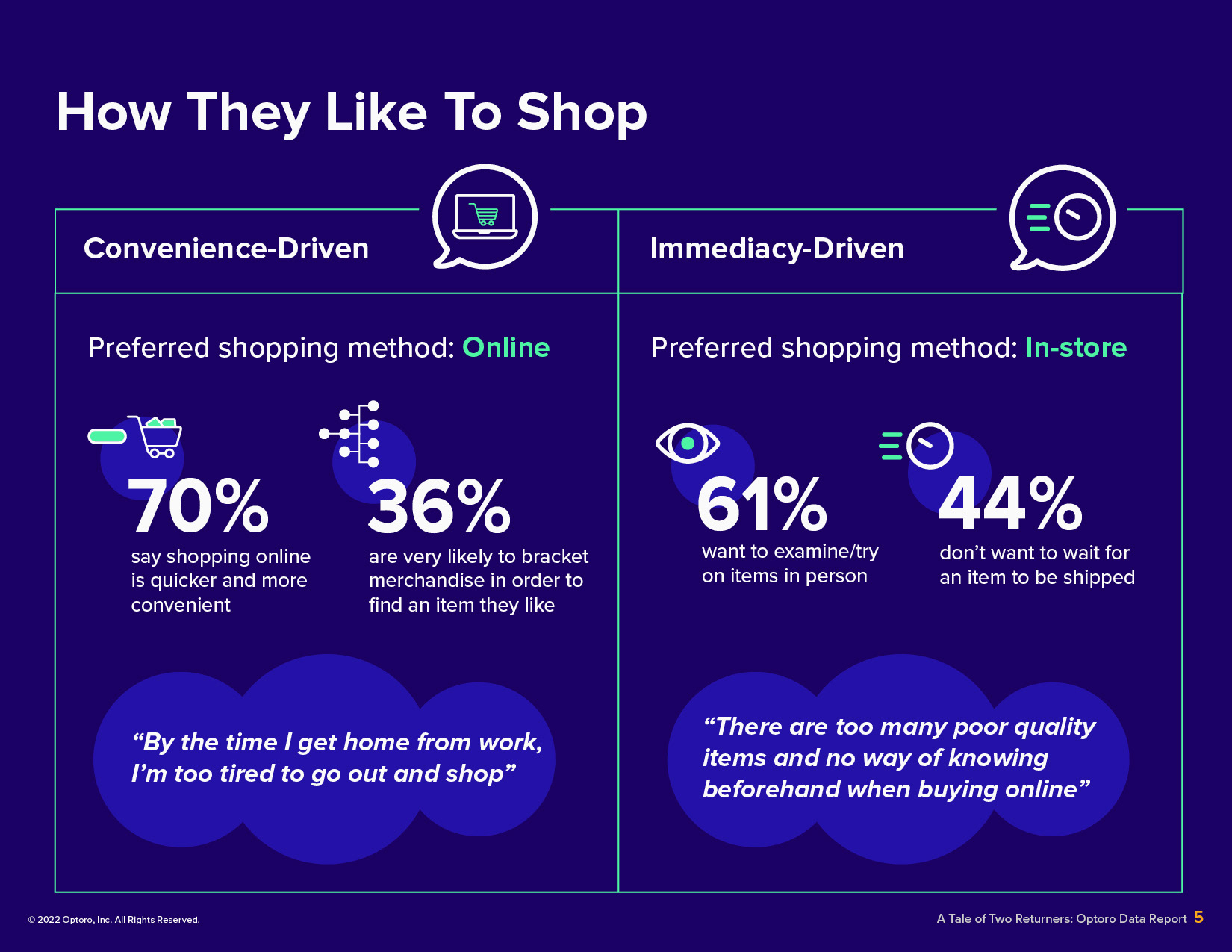
Use of playful patterns, bright and clean colors (pulling from auxiliary brand colors) and creating custom iconography for the report data.
Q2 2022 Data Report
Q2 2022 Data Report
Playful but on brand
While maintaining a professional and clean look, I brought some movement and playfulness to this report through my use of different size shapes and custom iconography reflecting the content of the report.
Q3 2022 Data Report
Q3 2022 Data Report
Results: Optoro Data Reports
Our data reports have doubled and tripled past stats
- 3x PDF downloads
- 2x+ conversions to MQLs
- 3x PDF downloads
- 2x+ conversions to MQLs
Reflections & Learnings:
You always learn something with every experiment
You always learn something with every experiment
The work I’ve done with Optoro’s Data Reports is some of my proudest work at the company. Not only did I teach myself more skills with Hubspot landing pages, but I pushed my team to try new avenues to convert leads.
While not every test was conclusive or helpful, over the quarters we have vastly improved our Data Report engagement and conversion.
It’s always a challenge to take rather dry data and make it easy to follow and engaging, but bringing in playful illustrations, colors and shapes adds so much to the reports and obviously impacts it’s readability and sales enablement potential.