Lookout : The Nature of Diversity
Have you ever wondered if the world you are seeing is the same world that everyone else sees? Chances are the combination of light and color perceived by your eyes creates an entirely different perspective of the world than the person standing next to you. You both could be looking at the exact same sunset and have radically different experiences. After all, color vision scientists have shown that the perception of color varies from human to human.
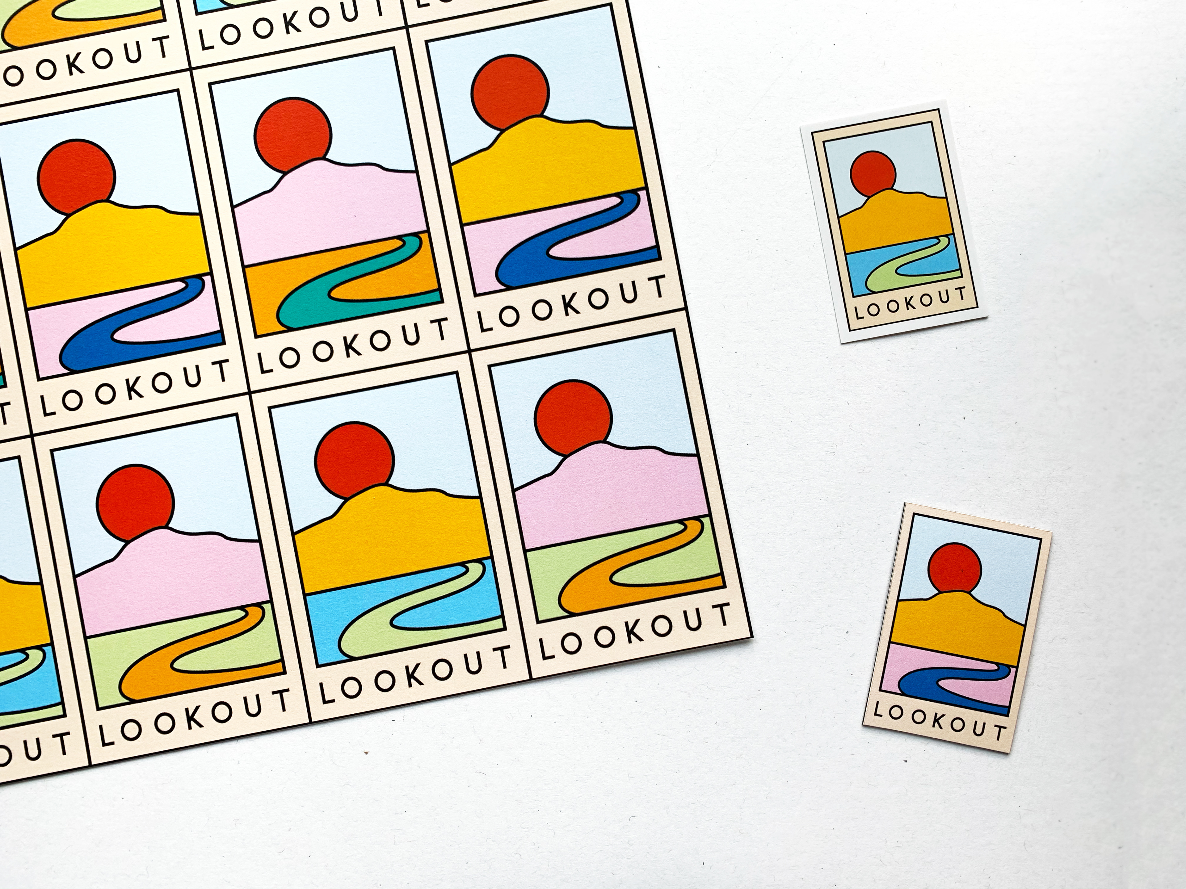
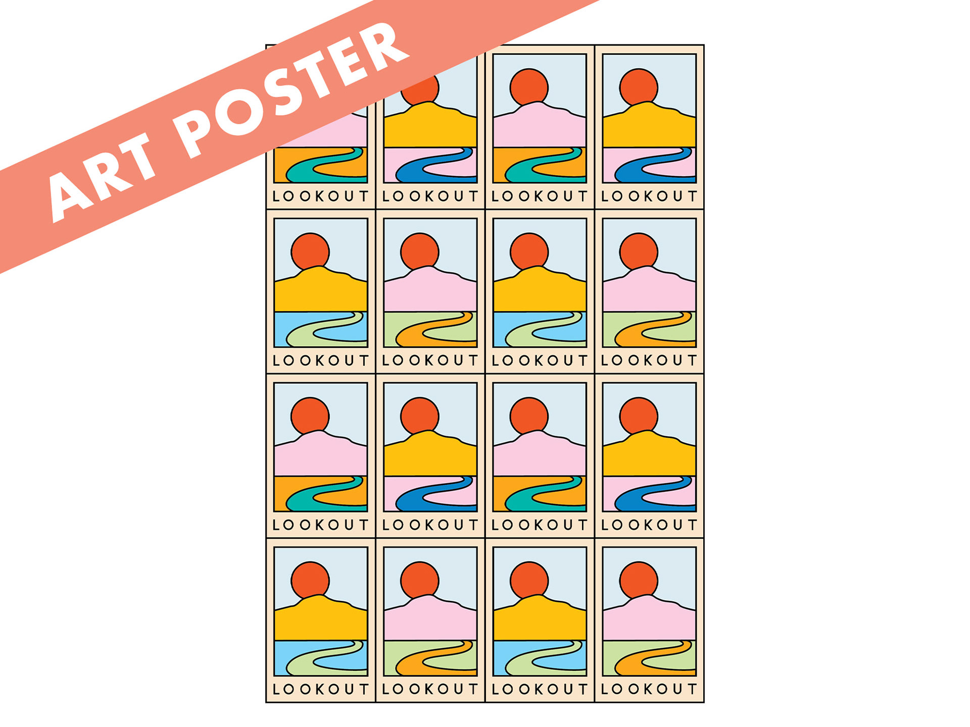
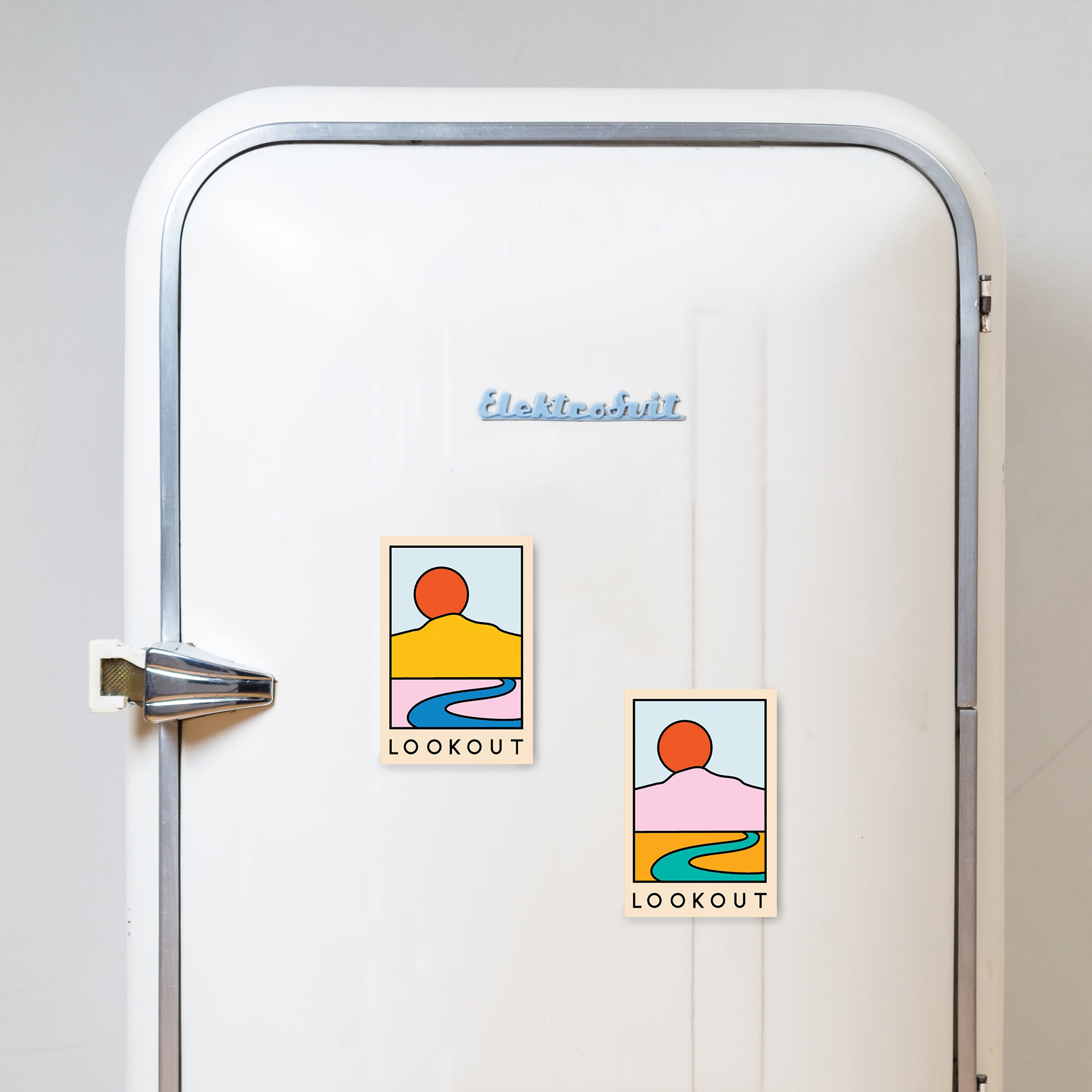
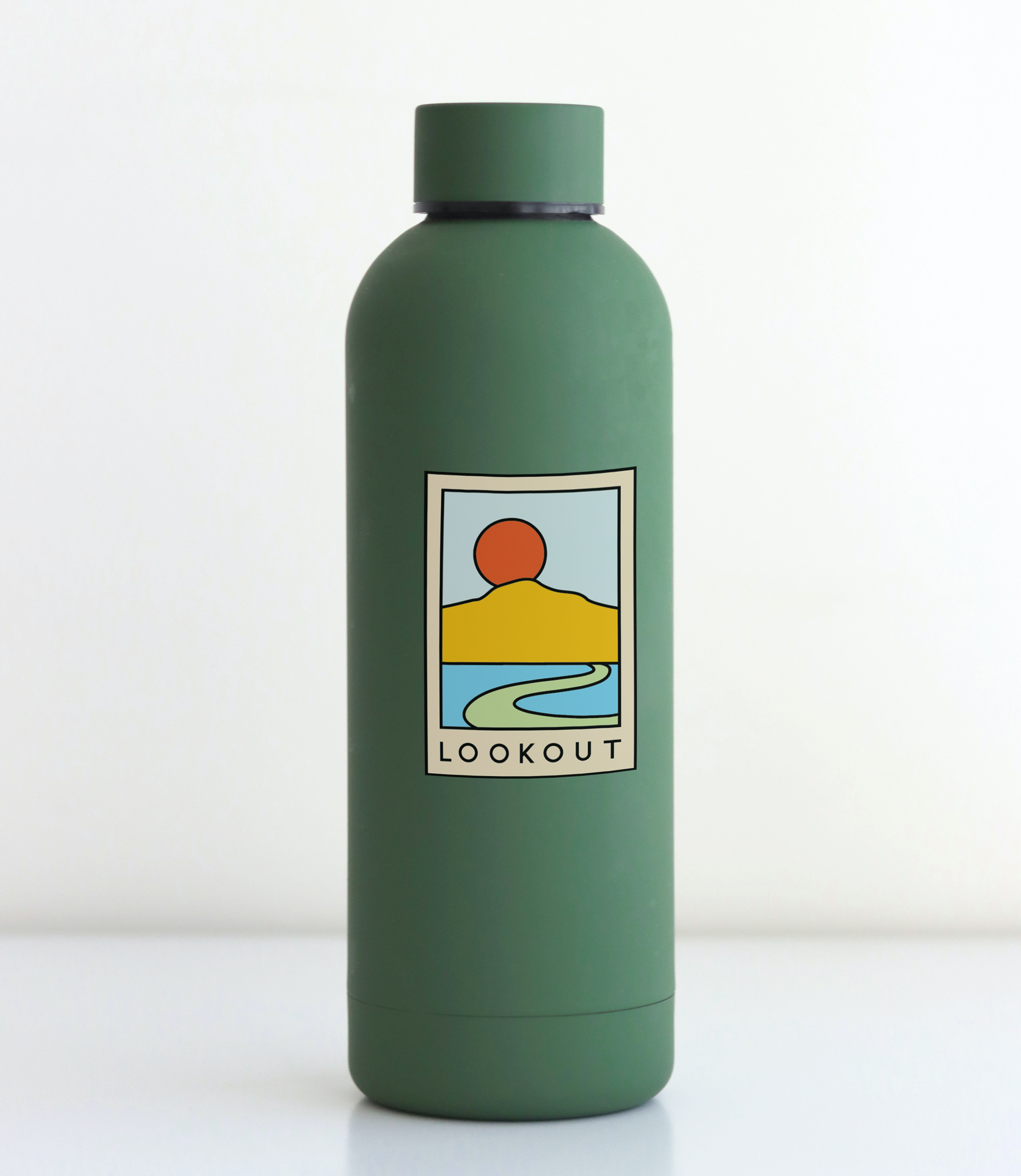
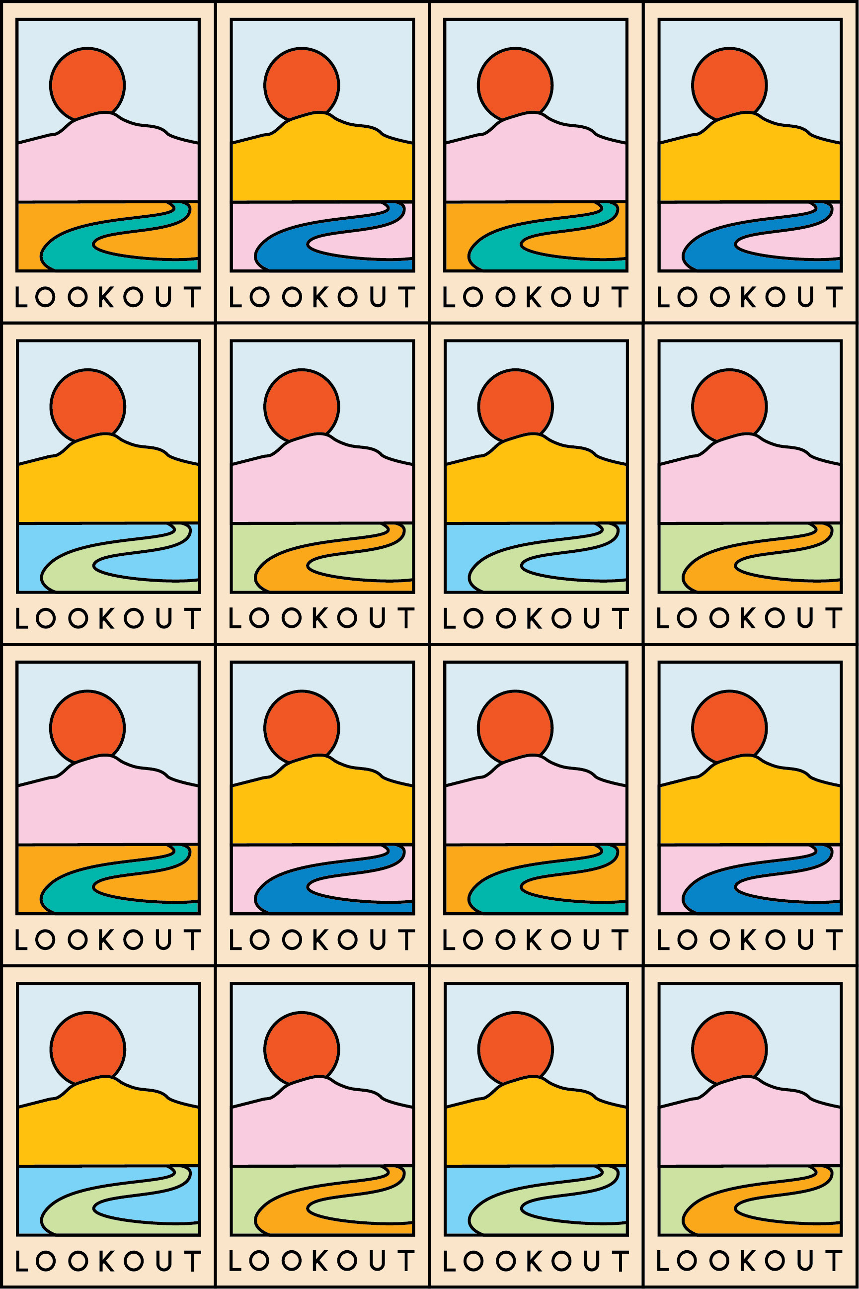
This revelation--along with the grand Chattanooga mountain views--was the inspiration for my piece. I took old postcards of the Chattanooga landscape and used them as a guide for the shapes of Lookout Mountain and the winding Tennessee River in my design, which has a bright and inviting color palette with the repeating postcard pattern as a nod to Warhol and the Pop Art era. The array of color combinations of the same base shapes represents how each resident of Chattanooga may see the beautiful landscape with a completely different interpretation. As a queer female artist, I wanted to create a design for ArtSpark that showed how each of us has our own view of the world around us as we involve ourselves and remind residents to “lookout” for the nature of diversity in everyday places.
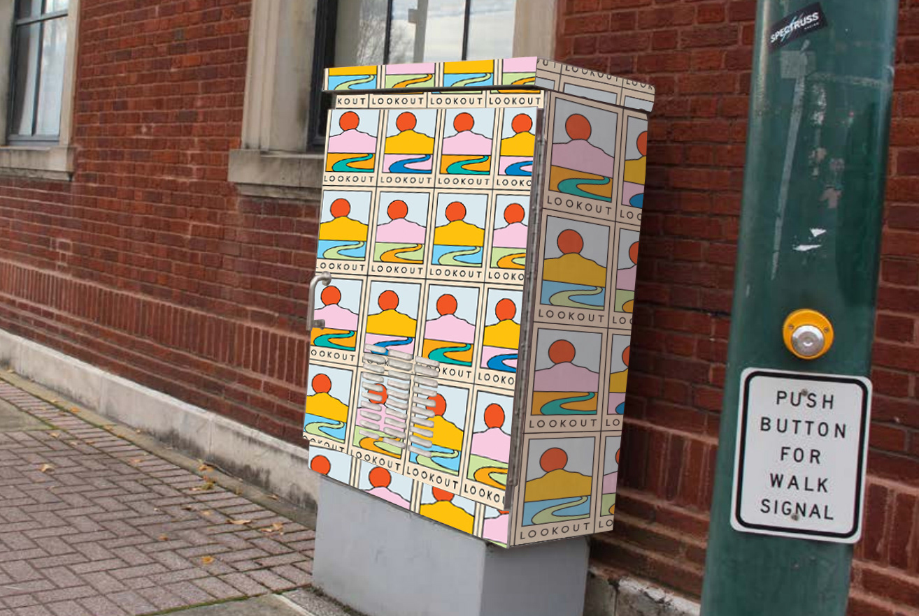
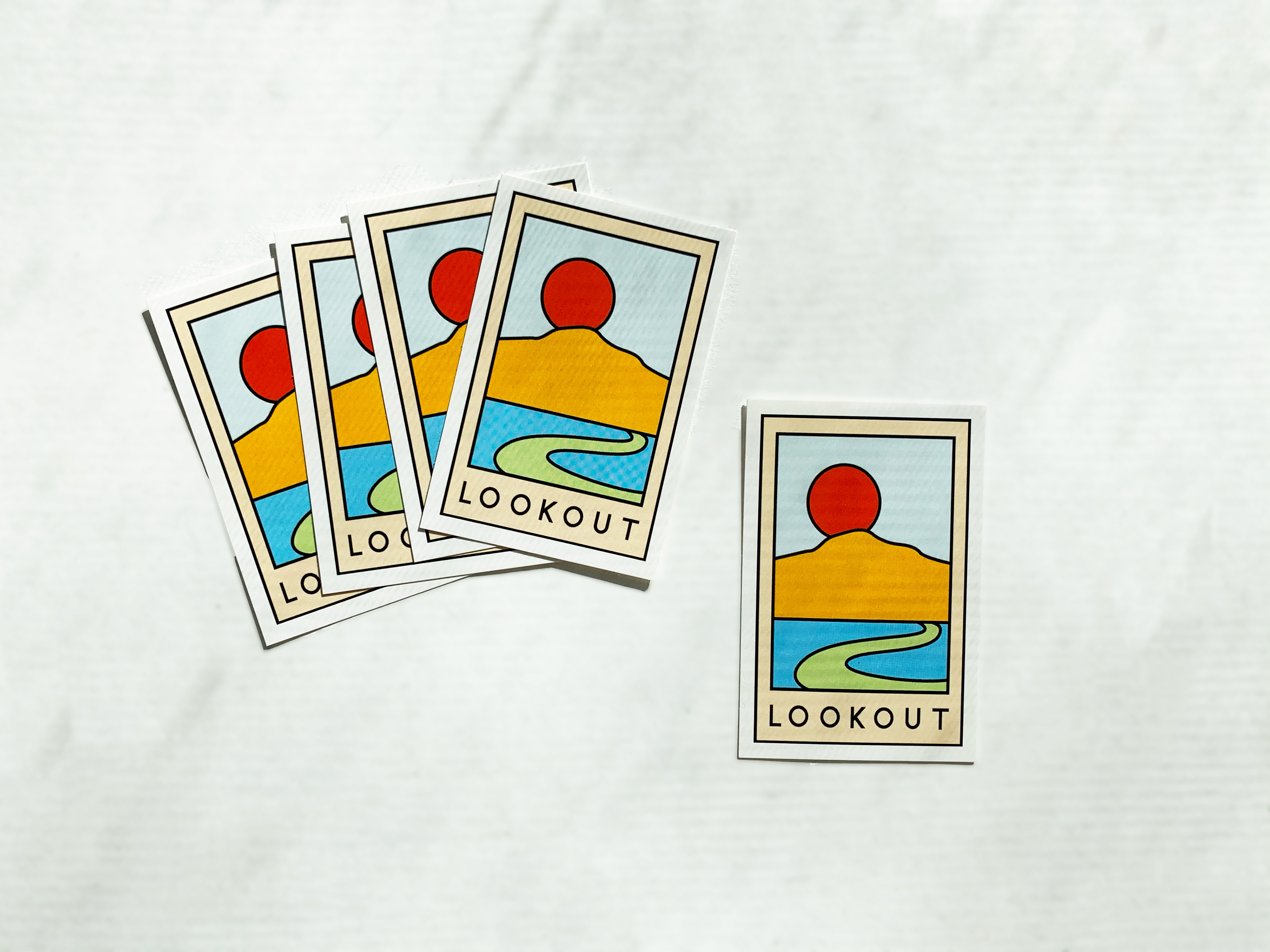
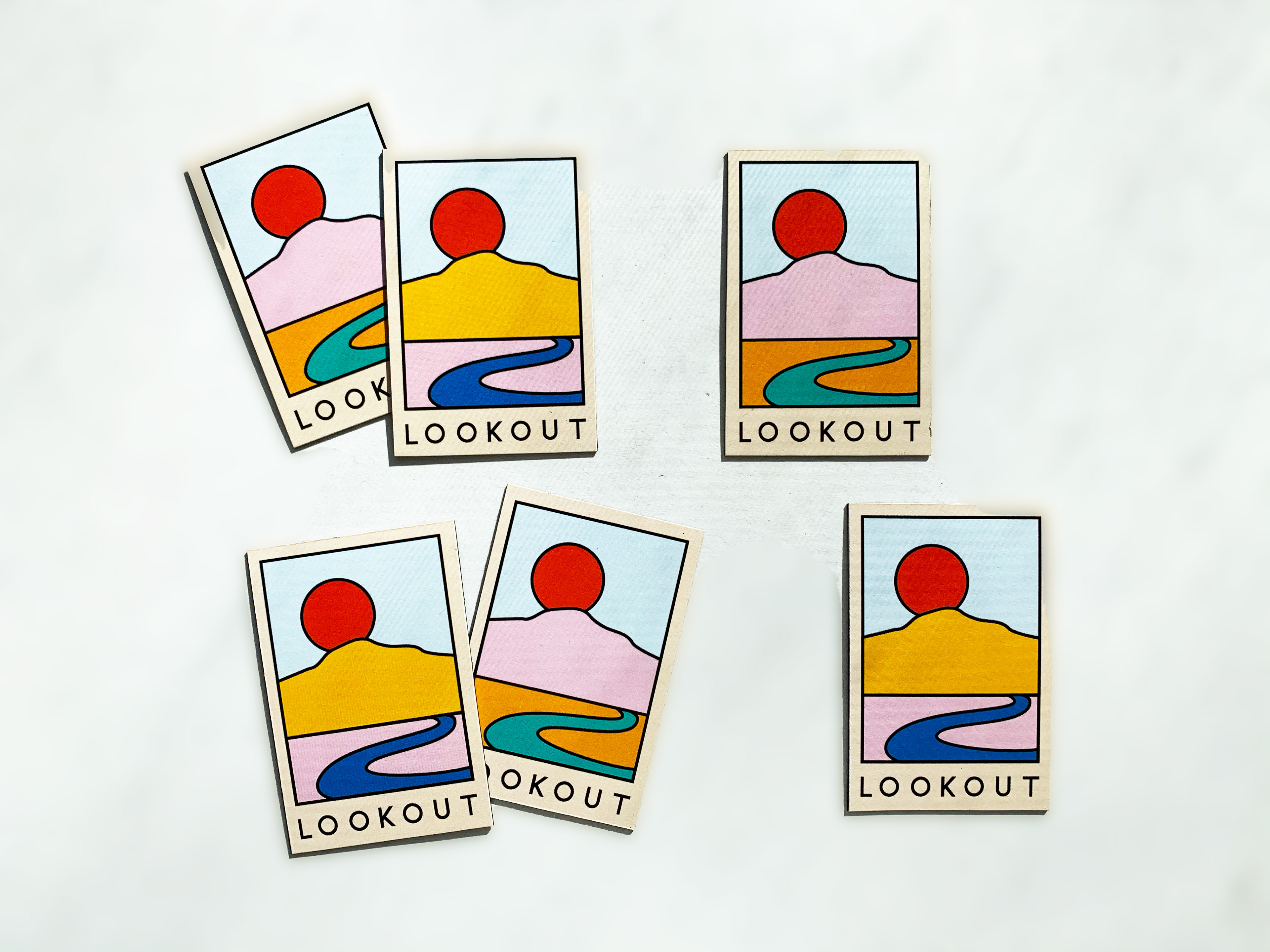
Originally, I designed LOOKOUT specifically for ArtSparkCHA, an initiative sponsored by EBP to cover their street electric boxes with art from locals that represents the values of Chattanooga or represents the amazing landscape. My design was not selected in 2019, but after posting on my personal Instagram, I got an amazing response and call for posters and merch with the design, so I have a limited collection in my store. I got to implement even more skills by putting together my own set of merch complete with stickers, fridge magnets and posters.
If you're interested in purchasing a piece of the collection, check out my store.